Creating ClickShip's Design System on Figma
Recognizing a gap in the development cycle where developers lacked a clear reference for app components, often relying on new designs without a comprehensive understanding of each element's variations, I advocated for a switch to Figma as the primary design tool for the team.
Why the Shift from Adobe XD to Figma?
In my experience collaborating with developers, I found that Adobe's features were cumbersome at the time of drafting this proposal. Adobe's limitations included the manual refreshing of design links to sync changes, the need to access a separate link for viewing comments, and the requirement for separate documentation when designing variations to highlight changes and use cases.
In contrast, Figma enables real-time visibility of design/developer comments within the design file, consolidating information into a single source of truth. It also facilitates an efficient examination of design variations, allowing users to compare changes at a glance and review changelog history, reducing the need for lengthy discussions and Jira comments.
Creating ClickShip's Design System
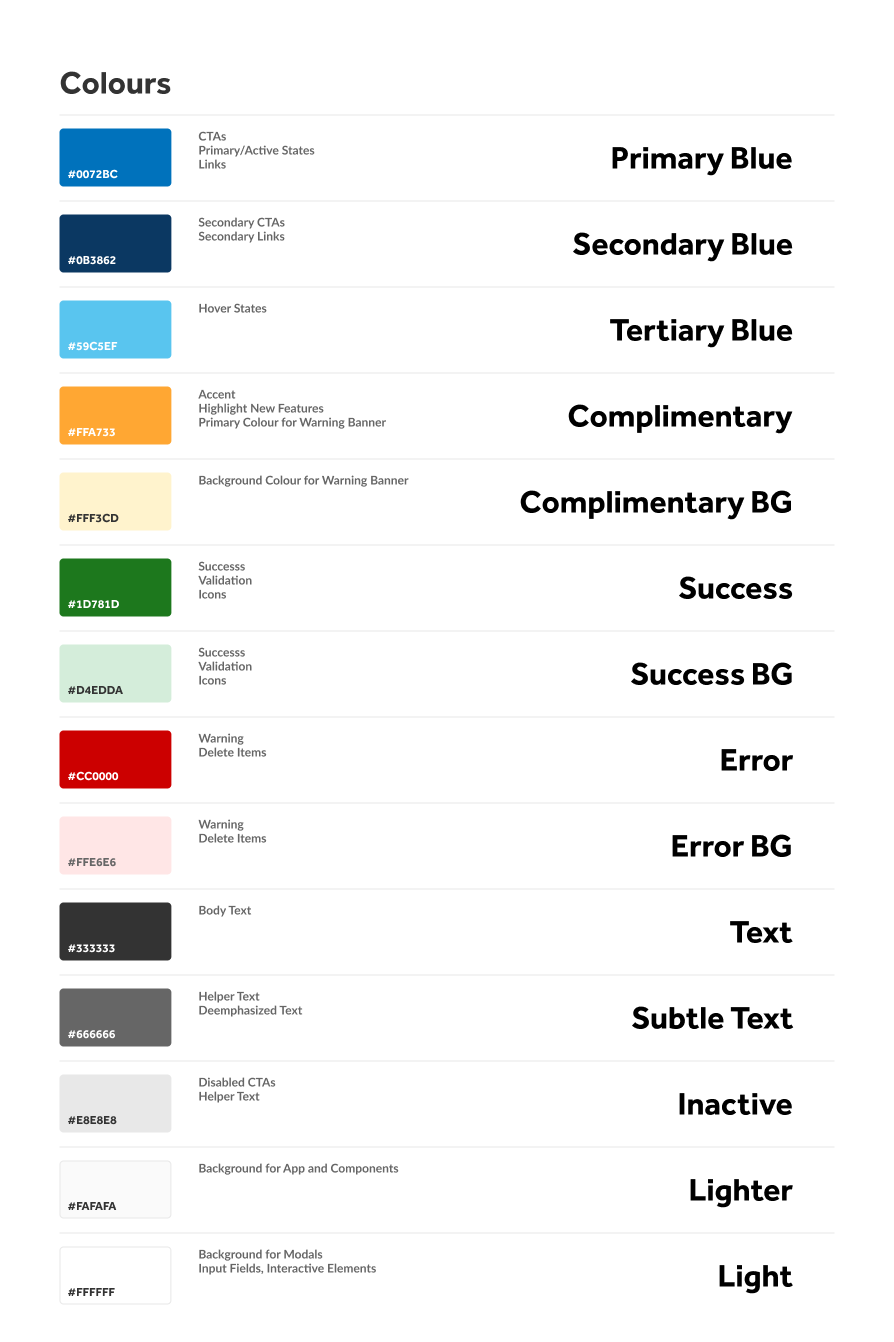
The initiative began with establishing a solid foundation in typography, addressing various use cases for each font family, size, and colour throughout the entire app. The next step involved creating styles for every colour present within the app by meticulously reviewing each existing page and documenting all colours. The design system was conceptualized with the understanding that these colours and styles would evolve as new requirements were implemented.


Highlighting Dev Mode on Figma
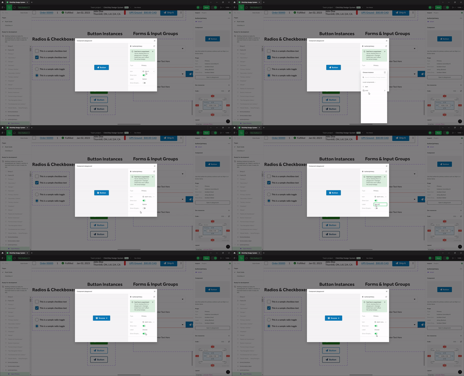
Introducing the Dev Mode feature empowered me to showcase the diverse instances and toggles necessary for implementing each component.
For instance, in defining button styles, I utilized the property tool to emphasize elements that could be toggled on/off, swapped, and the context in which each button should be used.
Conclusion
The transition to Figma yielded significant efficiency improvements for both designers and developers. It facilitated the establishment of a robust component system for developers, streamlining styling/CSS processes and accelerating development by eliminating the need to recreate components for each new feature. This transition also standardized the design across the platform, contributing to a more cohesive and efficient design and development workflow.

